
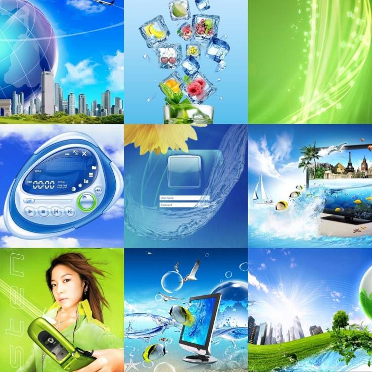
In the ever-shifting landscape of design aesthetics, one style from the early 2000s has quietly re-emerged to capture the imagination of a new generation: Frutiger Aero. Characterized by glossy surfaces, soft gradients, translucent layers, and a sense of digital serenity, Frutiger Aero once defined the look and feel of user interfaces, public signage, and branding at the dawn of the millennium. Now, it’s experiencing a surprising revival—led by Gen Z creators on platforms like TikTok and YouTube, and woven into vaporwave-inspired fashion and art.
The Glossy Origins of Frutiger Aero
Frutiger Aero rose to prominence in the early 2000s as a design language that balanced technical sophistication with approachable warmth. Named after the iconic Frutiger typeface, which was widely used in airport signage and public spaces, this aesthetic merged clean typography with shiny buttons, subtle reflections, and soft shadows. It was meant to evoke clarity and calmness in an era when digital technology was becoming ever more central to daily life but still felt new and intimidating to many.
This style offered a kind of visual optimism—a promise that technology could be friendly, sleek, and even beautiful. Operating systems like Windows XP and various software suites embraced Frutiger Aero-inspired interfaces that looked both futuristic and inviting, creating a sense of hopefulness about the digital future.
Why Gen Z is Returning to Frutiger Aero
So why is this early-2000s aesthetic resonating now with a generation born well after the style’s heyday? The answer lies in a complex mixture of nostalgia, emotional need, and cultural critique.
Nostalgia for Simpler Digital Times
While millennials grew up alongside the rise of smartphones and social media, Gen Z was born into a fully connected digital world, often marked by fast, fragmented, and overwhelming content. For many, Frutiger Aero represents a softer, slower, and more hopeful internet—one where interfaces looked inviting rather than aggressive or minimalistic.
TikTok creators frequently post videos exploring old-school computer aesthetics, demonstrating “retro tech setups” and digital art inspired by the era’s glossy interfaces. The aesthetic’s smooth, rounded buttons and glowing edges evoke a kind of digital nostalgia for a time before algorithmic overload and online toxicity took hold.

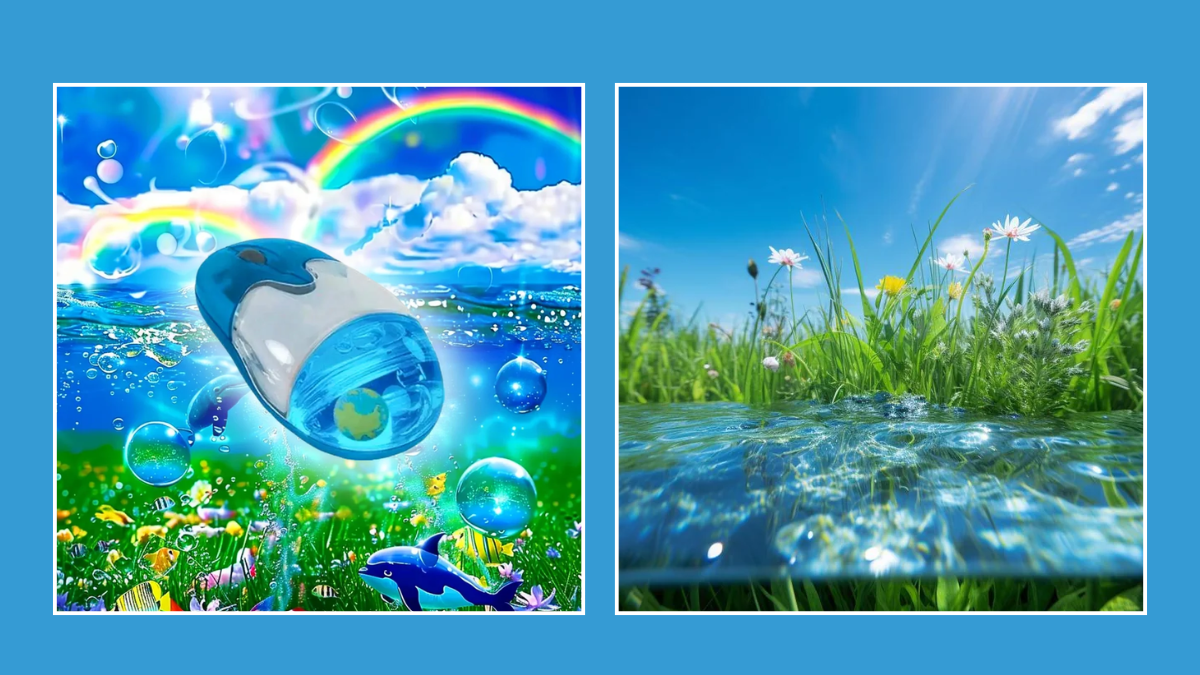
A Visual Rebellion Against Brutalism and Dark Mode
The 2020s have seen a surge in minimalist and brutalist design—sharp edges, stark contrasts, and dark themes dominate many apps and websites. While this style appeals to some, others find it cold, harsh, or even alienating.
Frutiger Aero’s warmth, translucency, and light-filled spaces offer a compelling alternative. Its reflective surfaces and gentle gradients invite calm and reassurance, making it a favourite among Gen Zers looking for comfort in their digital environments. This revival can be seen in vaporwave and synthwave art, which often incorporate Frutiger Aero elements to evoke a dreamy, utopian vibe that contrasts with the harsher realities of contemporary life.
Fashion and Art: Bringing Glossy Hope to Life
Beyond screens, Frutiger Aero’s influence spills into fashion and art. Vaporwave and Y2K fashion trends that champion shiny fabrics, iridescent accessories, and futuristic silhouettes owe much to this glossy, hopeful aesthetic. On platforms like Instagram and TikTok, influencers recreate early-2000s looks with a modern twist, pairing vintage tech-inspired elements with contemporary style.
Visual artists blend Frutiger Aero’s signature gradients and reflections with surreal, digital collages that comment on technology’s promises and pitfalls. This creates a layered dialogue between optimism and skepticism, resonating deeply with a generation navigating rapid technological change.
The Return of Glossy Hope
Frutiger Aero’s resurgence is more than just a retro fad; it’s a sign that design can embody emotional states and cultural desires. For Gen Z, glossy interfaces and soft, luminous colours represent a yearning for a digital world that feels humane, accessible, and even beautiful—a stark contrast to the fatigue of endless scrolling and digital cynicism.
In reclaiming Frutiger Aero, Gen Z isn’t just reviving an old look—they’re embracing a vision of technology as a source of hope, a dream of a future that is polished but not cold, futuristic but not alienating. It’s a reminder that even in an era of digital overwhelm, there’s still space for beauty, optimism, and the soft glow of possibility.
---Silviya.Y

