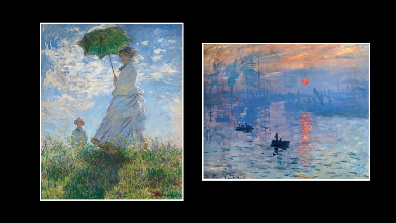
Impressionism, a groundbreaking art movement that emerged in the late 19th century, revolutionized the way artists perceived and depicted the world around them. By focusing on the play of light, vibrant colour palettes, and the fleeting moments of everyday life, Impressionist painters like Claude Monet, Pierre-Auguste Renoir, and Edgar Degas created works that continue to captivate viewers today. However, the influence of Impressionism extends far beyond the canvas; its principles of colour theory and light have permeated modern pop culture, shaping the visual aesthetics of music videos, fashion, and graphic design. Let’s delve into how the vibrant colour palettes and light techniques of Impressionist art are reflected in contemporary media.
The Kaleidoscope of Music Videos
Music videos, as a visual medium, are an ideal canvas for the exploration of colour and light. Directors and cinematographers often draw inspiration from Impressionist techniques to create mood, evoke emotion, and enhance the storytelling of the music.
One striking example is Beyoncé’s ‘Hold Up’ (2016) from her visual album ‘Lemonade’. The music video opens with the singer emerging from a submerged room, bathed in a golden light that seems to ripple like water—an effect reminiscent of Monet’s treatment of sunlight on water in his famous ‘Water Lilies’ series. The vibrant yellows and warm tones throughout the video create a surreal, dreamlike atmosphere, echoing the Impressionists’ love for capturing the ephemeral beauty of a moment.

Similarly, Pharrell Williams’ ‘Happy’ (2013) utilizes bright, sunlit scenes and bold, primary colours to evoke a sense of joy and exuberance. The use of natural light and the choice of locations—outdoor settings bathed in sunshine—mirror the Impressionists’ focus on capturing the effects of light in natural environments. The video’s buoyant energy and uplifting colour scheme are direct nods to the movement’s emphasis on the interplay of light and colour.

The Impact of Impressionist Paintings in Fashion: A Living Palette
The world of fashion is another arena where the influence of Impressionist colour theory is evident. Designers frequently draw from the movement’s vibrant palettes and delicate interplay of light to create clothing that feels both timeless and modern.
For instance, fashion houses like Dior and Chanel have, over the years, incorporated Impressionist-inspired colours into their collections. The use of soft pastels, muted earth tones, and iridescent fabrics that change colour with the light reflect the Impressionists’ fascination with capturing the shifting hues of nature. Runway shows often feature designs that seem to shimmer and change as the models move, much like the changing light in a Monet landscape.
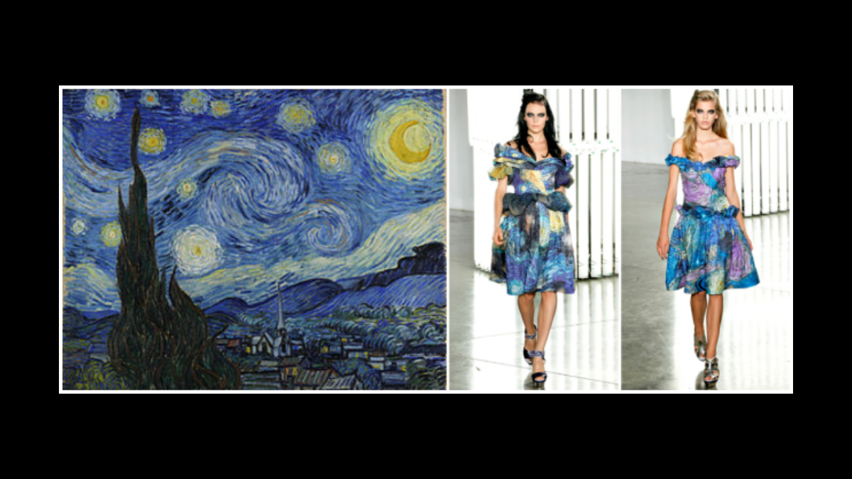
In a more direct homage, Rodarte’s Spring 2012 collection drew explicit inspiration from Vincent van Gogh’s ‘Starry Night’, an iconic post-Impressionist work closely related to the movement. The collection featured dresses adorned with swirling patterns and bold blues and yellows, capturing the movement and energy of van Gogh’s brushstrokes. This blending of art and fashion illustrates how Impressionist colour theory continues to inform the choices of contemporary designers.
Graphic Design: Colour and Emotion
In graphic design, the principles of Impressionist colour theory are often employed to create visually striking compositions that evoke emotion and atmosphere. Designers use colour to draw the viewer’s eye, convey a mood, or tell a story—much like the Impressionists did with their paintings.
For example, the use of gradient backgrounds, which blend multiple colours seamlessly, can be traced back to the Impressionists’ technique of transitioning between hues to suggest light and depth. These gradients are widely used in modern graphic design, from website layouts to app interfaces, creating a dynamic and engaging user experience.
Moreover, the trend of using bold, contrasting colours to create visual impact has roots in the Impressionist technique of juxtaposing complementary colours. This can be seen in everything from movie posters to album covers, where designers use bright, clashing colours to grab attention and evoke a particular emotional response. The contrast between warm and cool tones, a staple of Impressionist painting, is especially prevalent in designs that aim to create a sense of vibrancy and movement.
Also Read: Impressionism: Monet’s Brushstrokes Shaping Film Aesthetics
The Enduring Legacy of Impressionist Colour Theory
The influence of Impressionist colour theory on modern pop culture is a testament to the movement’s enduring legacy. By experimenting with light, colour, and atmosphere, the Impressionists laid the groundwork for a visual language that continues to inspire artists, designers, and creators across various media. Whether it’s the golden glow of a music video, the shimmering fabric on a runway, or the vibrant hues of a graphic design, the principles of Impressionism are alive and well in today’s visual culture.
As technology evolves and new forms of media emerge, the Impressionist approach to colour and light remains a guiding force, reminding us of the beauty in the everyday and the power of colour to transform our perception of the world. The movement’s emphasis on capturing the fleeting, the ephemeral, and the emotional ensures that its influence will continue to resonate in pop culture for generations to come.
--Silviya.Y

