The epitome of killer rock band logos goes beyond the corporate vibe, ditching the suit for a wild ride of trippy, edgy and downright bold aesthetics. Think The Rolling Stones' sizzling 'Hot Lips' and Nirvana's electric yellow smiley face—these logos are a psychedelic nod to the rebellious spirit of classic and progressive rock from the 60s and 70s.
The Rolling Stones
Image Courtesy: uDiscover Music
Dive into the rock archives, and you'll stumble upon the ultimate symbol of English rock coolness—the 'Hot Lips' insignia. This emblem? A badass representation of Kali, the Hindu goddess of energy, rocking an epic mouth and tongue, not to mention a pumped-up nod to Mick Jagger's unmistakable grin. It's not just a logo; it's a vibe, a rock saga etched in visual glory.
Nirvana
Image Courtesy: Worldvectorlogo
Enter the grunge scene, the alternative rock playground pioneered by the legendary Nirvana. Picture it: the epitome of grunge vibes embodied in their darkly humourous smiley face logo. With X-shaped eyes, a protruding tongue, and a twisted grin, this isn't your typical happy-go-lucky smiley—it's a gritty, edgy masterpiece that defines the rebellious spirit of the genre.
Aerosmith
Image Courtesy: Pinterest
The band's logo is a loud shout for freedom! The central icon appears to be in dynamic motion, unfurling its wings, and the encircling ring around the letter 'A' throws off major anarchy vibes. It's not just a logo; it's a visual anthem of rebellion and untamed spirit.
Bon Jovi
Image Courtesy: PNGWing
Feel the pulse of the musical narrative, where Bon Jovi's emblem becomes the anthem of heartbreak. A bloodied dagger piercing through a heart— a visual symphony that hits you with a wave of sensitivity and gothic allure. It's not just a logo; it's a cool, melancholic masterpiece encapsulating the raw emotion of love gone awry.
Red Hot Chili Peppers
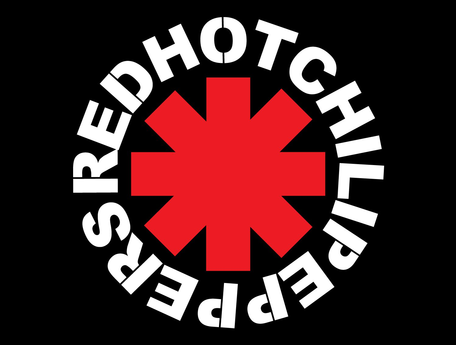
Image Courtesy: Extra Chill
Behold the Red Hot Chili Peppers' vibe-packed emblem featuring the eight-pronged 'Star of Affinity.' Rumoured to symbolize not just cardinal directions but the chaotic crossroads of life, it takes center stage in the band's logo. The bold aesthetics, rocking a red, black and white palette, scream passion and dominance, turning their logo into a visual anthem of cool intensity.
AC/DC
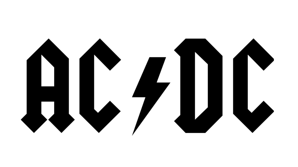
Let's amp it up: AC/DC, the electrifying maestros, derive their name from alternative current/direct current electricity, and their logo is the visual surge that mirrors this power play. Picture it: a lightning bolt crackling with raw energy, paired with typography so bold and angular, it's practically sonic architecture. It's not just a logo; it's a voltage-charged emblem, a symbol of the band's relentless, high-octane spirit.
Guns N’ Roses
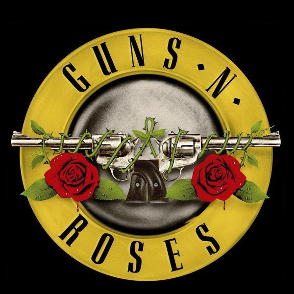
Image Courtesy: Pinterest
Check out the fusion of Tracii Guns and Axl Rose's last names in the band's moniker, and that synergy echoes in their logo. Picture this: a dark and romantic vibe with guns and roses taking center stage. It's not just a logo; it's a cool, edgy narrative, a visual anthem of the band's gritty and contemplative aura.
Led Zeppelin
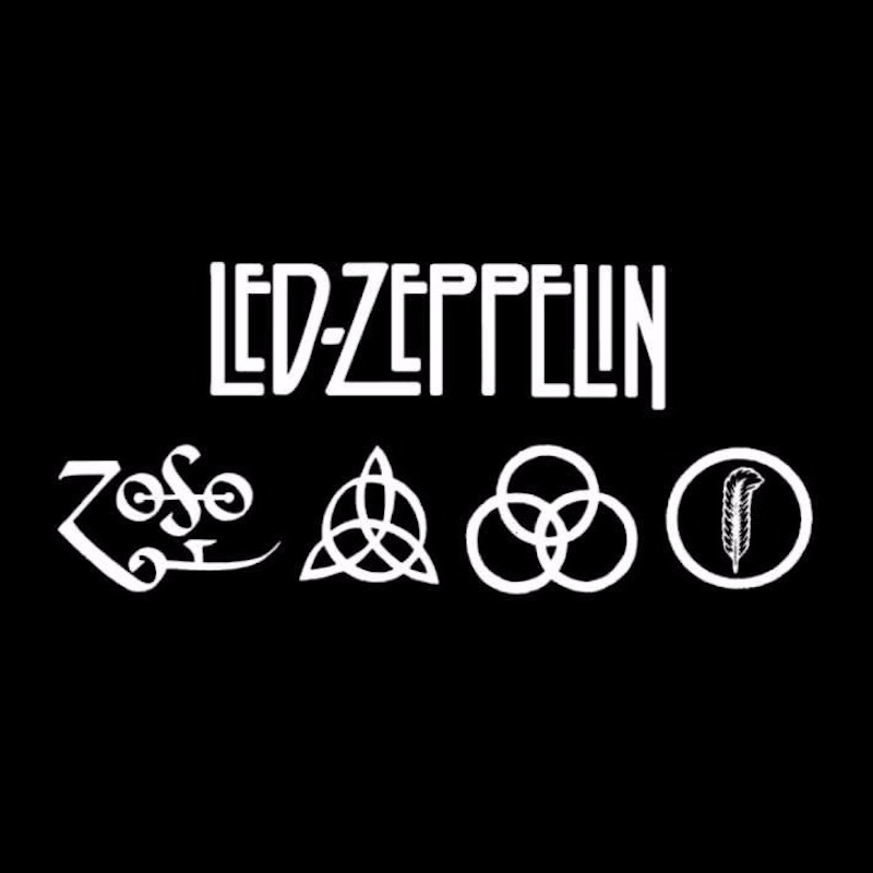
Image Courtesy: Extra Chill
Led Zeppelin kicks it up a notch with their logo game. Think four illustrations, each a nod to a band member, drawing inspiration from ancient symbols and mythology. Check out Robert Plant's emblem on the far right—it's rocking the feather of Ma'at, the Ancient Egyptian Goddess of justice. It's not just typography; it's a visual saga, a cool fusion of rock and ancient mystique.
Queen
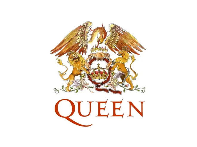
Image Courtesy: Smooth
Queen's debut album in '71 unleashed not just tunes but an iconic logo that became the band's visual anthem. Picture Freddie Mercury, the lead singer and art school aficionado, crafting this masterpiece. Each emblematic animal in the design aligns with a band member's horoscope. There are two lions for drummer Roger Taylor and bassist John Deacon, who are Leos; a crab for guitarist Brian May, a Cancer; and two fairies for Freddie, who was a Virgo. Right in the mix, a bold 'Q' complete with a crown, possibly signifies the band. Lurking behind this crew, a phoenix adds a touch of enigma, reminiscent of the Royal coat of arms of the United Kingdom.
The Doors
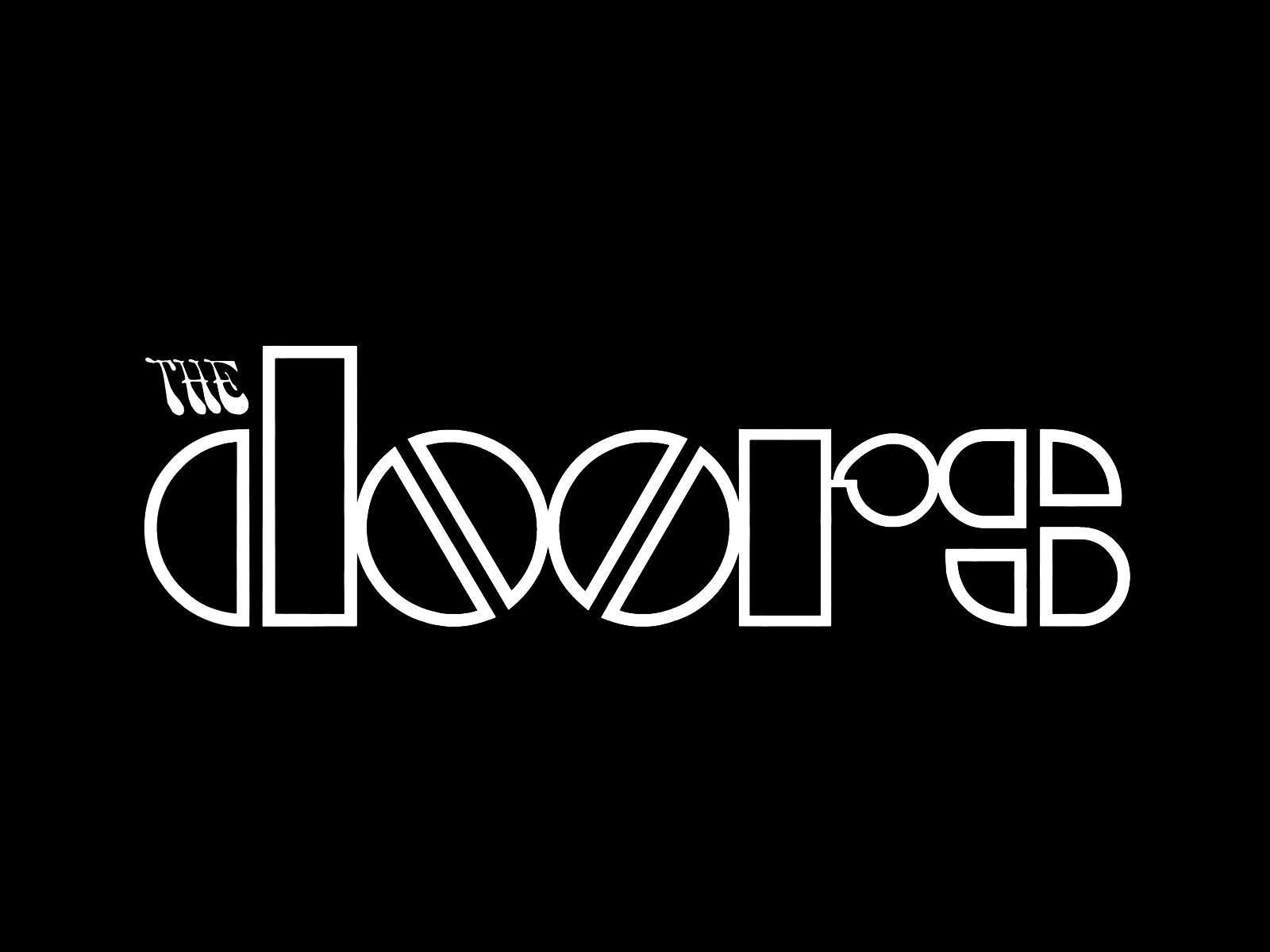
Image Courtesy: Pinterest
Check out the logo of this American rock powerhouse, rocking a bold geometric typeface and double-Os that are a mirror-image spectacle. It's a total 1960s vibe! The O's? They're not just circles; they're split in half, giving off a pill-like coolness. And don't overlook the subtle yet crucial 'THE'—it's in a psychedelic typeface straight out of the swinging 60s, with that groovy backward slant. It's not just a logo; it's a visual trip, a nod to the psychedelic rock journey that defines their music. Dig it?
---Silviya.Y

